Democratizing Data Analysis with Generative AI

Organizations today are drowning in data but starving for insights. While the availability of data has skyrocketed, extracting meaningful information from it remains a slow, skill-intensive process. The result? Data scientists are overwhelmed with requests, and non-technical team members struggle to get the insights they need to make informed decisions. This is the data analysis bottleneck, and solving it could unlock a wave of productivity across industries.
Introducing the Data Analysis Assistant
The Data Analysis Assistant is a powerful tool designed to revolutionize how organizations interact with their data. By simplifying complex analysis processes, it empowers users to quickly and intuitively uncover actionable insights from datasets, regardless of their technical expertise. This app bridges the gap between raw data and informed decision-making, democratizing access to meaningful analysis and reducing the burden on overworked data teams.
The Inspiration Behind the Data Analysis Assistant
The Data Analysis Assistant was born out of the recognition that organizations face significant barriers to extracting meaningful insights from their data. The challenge lies in the dependency on specialized technical skills and the overwhelming demand placed on data teams. This imbalance inspired the creation of a tool that could simplify and democratize the analysis process.
The goal was straightforward: empower every user—from non-technical team members to seasoned analysts—to unlock insights effortlessly. By leveraging automation, machine learning, and user-friendly design, the assistant bridges the gap between data and decision-making, ensuring that anyone can uncover actionable intelligence without needing a data science background.
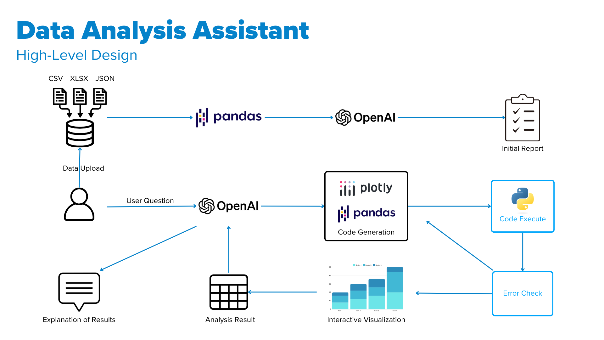
How the Data Analysis Assistant Works
The app’s design revolves around simplicity and intelligence. Users begin by uploading a dataset in formats like CSV, Excel, or JSON. Once uploaded, the assistant automatically generates a detailed report that highlights key insights. This includes descriptive statistics, correlations, and outlier detection—a comprehensive first look at the data.
But the real magic happens when users interact with the app. Through a chat interface, they can ask questions in natural language, such as, “What’s the average churn rate for customers with more than two products?” The assistant interprets these queries, generates Python code to address them, and produces accurate results validated through an error-checking loop.
Each query also generates an interactive visualization using Plotly, making it easier for users to explore the data further. Alongside these visualizations, the app provides clear, plain-language explanations to ensure insights are accessible to everyone, regardless of their technical background.
Demo 1: Customer Churn Analysis
In the first demo, the assistant analyzes a customer churn dataset. It demonstrates:
Churn rates by contract type and payment method.
Training machine learning models to predict churn.
Analyzing which features are most predictive of customer churn.
This demo highlights the app's ability to perform both exploratory analysis and predictive modeling, giving users a deeper understanding of the drivers behind customer retention and loss.
Demo 2: Financial Statement Analysis for Apple
The second demo showcases an analysis of Apple’s quarterly financial statements. The assistant:
Displays key financial metrics over time.
Compares the latest financial ratios.
Forecasts revenue, assets, and free cash flow using the Prophet library.
This example illustrates the assistant’s capacity for time-series analysis and forecasting, providing actionable insights for financial planning and strategy.
Demo 3: Comparative Analysis of Retailers
The third demo focuses on a comparative analysis of financial statements from apparel retailers. It emphasizes the app’s advanced visualization capabilities by generating:
Bubble charts.
Box and violin plots.
Heatmaps.
Waterfall charts.
These visualizations demonstrate the app's ability to handle complex analyses and present insights in visually compelling ways, catering to the needs of businesses aiming to benchmark performance or identify market opportunities.
Behind the Scenes: A Seamless Blend of Technologies
One of the most powerful aspects of the Data Analysis Assistant is its flexibility. The prompts and orchestration that power the assistant can be customized to align with the unique needs of different organizations and use cases. Whether it's tailoring the language model’s instructions to prioritize specific types of analyses or integrating domain-specific workflows, the assistant adapts to deliver targeted insights. This customization ensures that the tool is as relevant and effective as possible for a variety of industries and challenges.
Creating this assistant required bringing together several technologies in a cohesive workflow. Python’s pandas library forms the backbone for data aggregation and summary, while OpenAI’s GPT API generates insights and writes Python code. Plotly enables interactive visualizations, and an iterative error-handling system ensures the generated code works as intended. This combination allows the assistant to function as a reliable and intelligent data companion.
The Road Ahead
The Data Analysis Assistant is just the beginning. Future iterations will likely include advanced features like automated data cleaning, more advanced predictive modeling, and seamless integration with business intelligence platforms. These enhancements will further reduce barriers to entry, ensuring that anyone can unlock the full potential of their data.
As organizations continue to grapple with information overload, tools like this assistant offer a glimpse into a future where data-driven decision-making is not just the domain of experts but a skill accessible to all. By addressing the data analysis bottleneck, we can unleash a wave of innovation and productivity across industries.